
A compound bar chart is useful for when you want to express two or more quantities on one chart. The clear presentation of the bar chart allows for comparison between different values, but if you are comparing many different quantities, it may be useful to color code the different bars for easy comparisons and groupings.
- Pen
- Ruler
- Paper
- Data
Collect the data you wish to express as a compound bar graph. For example, data collected from an analysis of crime rates in Detroit, Boston and Chicago in 2008, 2009 and 2010 would be ideal for producing this kind of graph, as the data is quantifiable and cannot be expressed as a simple bar chart.
Present your data in a table. This makes the data easily accessible for drawing your chart. In this example, you would assign a column to each of the three cities and then assign a horizontal row for each of the three years, then insert the relevant data into each corresponding cell.
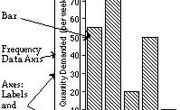
Draw your graph’s X and Y axis. Along the Y axis--the vertical axis--write a scale of values that will illustrate your results. For example, if your results are all below 10 then a scale of one to 10 will suffice; if they are up to 1,000 it may be easier to go up in hundreds. Along the X--or horizontal--axis, mark your data parameters with a main heading and then several subheadings. In the example from Step 1, the names of the cities would be the main headings and the years would be the subheadings.
Add your data to the graph. Continuing the example, if Detroit 2008 is the first piece of data on the graph, plot this information from the table onto the chart by drawing a solid bar. The bar’s width will be the width of the subheading and its height will correspond to value of the data. Repeat this for each of the subheadings for Detroit, then move onto Boston and Chicago until all the data from the table is plotted onto the chart.
Things You'll Need
References
About the Author
Julia Salgado has been writing professionally since 2007. Her work has been published by the "Manchester Evening News" and "Q Magazine." Salgado holds a Bachelor of Arts in English from Manchester Metropolitan University.