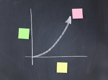

Graphs are an excellent way to make a visual representation of data that have been collected. However, without proper labeling, the graph won't make sense. Therefore, make sure you label the x-axis and y-axis and title your graph so it can be understood by people without having to ask what it represents.
TL;DR (Too Long; Didn't Read)
To properly label a graph, you should identify which variable the x-axis and y-axis each represent. Don't forget to include units of measure (called scale) so readers can understand each quantity represented by those axes. Finally, add a title to the graph, usually in the form "y-axis variable vs. x-axis variable."
Labeling the X-Axis
The x-axis of a graph is the horizontal line running side to side. Where this line intersects the y-axis, the x coordinate is zero. When using a graph to represent data, determining which variable to put on the x-axis is important because it should be the independent variable. The independent variable is the one that affects the other. For example, if you were plotting time worked against dollars made, time would be the independent variable because time would pass regardless of income.
Adding Scale to the X-Axis
You must also chose a proper scale for the x-axis and label it with the proper units. For example, if you did an experiment with different amounts of fertilizer to see its effect on plant growth and used the x-axis to show how much fertilizer you used, the scale for the x-axis should go from zero to the maximum amount of fertilizer you used.
Let's say you used 5g fertilizer for one group, 10g for a second group and 15g for a third group. Your scale could be marked off every 5g, and the title below the x-axis would be "Fertilizer (grams)." If you didn't include the unit of measure, people reading the graph wouldn't know if you gave each plant 5g of fertilizer, 5 cups or 5 pounds.
Labeling the Y-Axis
The y-axis of the graph is the vertical line running top to bottom. Where this line intersects the x-axis, the y coordinate is zero. When using a graph to represent data, the y-axis should represent the dependent variable. The dependent variable is the one that is affected by the independent variable. For example, if you were plotting time worked against dollars made, dollars made would be the dependent variable because the amount made depends on how many hours were worked.
Choosing Scale for the Y-Axis
You must also choose (and label) a proper scale for the y-axis, just as you did for the x-axis. For example, if you did an experiment to see how different amounts of fertilizer affected plant growth, the y-axis would represent the plant growth, and its scale would go from zero to the maximum amount a plant grew. Let's say one group averaged 8cm of growth, the second averaged 15cm of growth and the last group averaged 10cm of growth. The scale could go from zero to 15, and the y-axis title would be "Growth (centimeters)." If you didn't add the unit of measure, people wouldn't know if you were talking about growth in millimeters, inches or miles.
Titling the Graph
Your graph isn't complete without a title that summarizes what the graph itself depicts. The title is usually placed in the center, either above or below the graph. The proper form for a graph title is "y-axis variable vs. x-axis variable." For example, if you were comparing the the amount of fertilizer to how much a plant grew, the amount of fertilizer would be the independent, or x-axis variable and the growth would be the dependent, or y-axis variable. Therefore, your title would be "Amount of Fertilizer vs. Plant Growth."
References
About the Author
Mark Kennan is a writer based in the Kansas City area, specializing in personal finance and business topics. He has been writing since 2009 and has been published by "Quicken," "TurboTax," and "The Motley Fool."