How To Graph A Pie Chart When The Categories Overlap
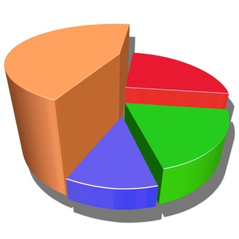
Graphs and charts show statistical information in a visual format. Graphs make it easy to compare data and process it quickly. You can make a bar graph to compare two or more amounts in relation to each other or a pie chart to compare parts to a whole. If categories overlap in a pie chart, you need to create a new category including both topics.
Step 1
Create a list of the items or categories you need to include on the pie chart. For an example, use expenses in a household of $575 for rent, $70 for electric, $45 for heat and $25 for water.
Step 2
Add all expenses together for a total of $715 in expenses for the month. Convert each number to a percent of the whole by dividing it by $715. Rent is 80.4 percent, electric is 9.8 percent, heat is 6.2 percent and water makes up 3.6 percent of your monthly expenses. Each section has a portion on the graph.
Step 3
Combine the two expenses you want to overlap into a single category, such as electric and heat. The new total is $115 and makes up 16 percent of the monthly expenses. The new graph eliminates two separate categories for heat and electric and links them together in a new category.
TL;DR (Too Long; Didn't Read)
Not all graphs are ideal for all situations. You may be better suited to make a bar or line graph with the data. Experiment to see which type displays the data most effectively.
References
Cite This Article
MLA
Rumble, Amanda. "How To Graph A Pie Chart When The Categories Overlap" sciencing.com, https://www.sciencing.com/graph-pie-chart-categories-overlap-10074031/. 24 April 2017.
APA
Rumble, Amanda. (2017, April 24). How To Graph A Pie Chart When The Categories Overlap. sciencing.com. Retrieved from https://www.sciencing.com/graph-pie-chart-categories-overlap-10074031/
Chicago
Rumble, Amanda. How To Graph A Pie Chart When The Categories Overlap last modified March 24, 2022. https://www.sciencing.com/graph-pie-chart-categories-overlap-10074031/
