How To Label A Histogram
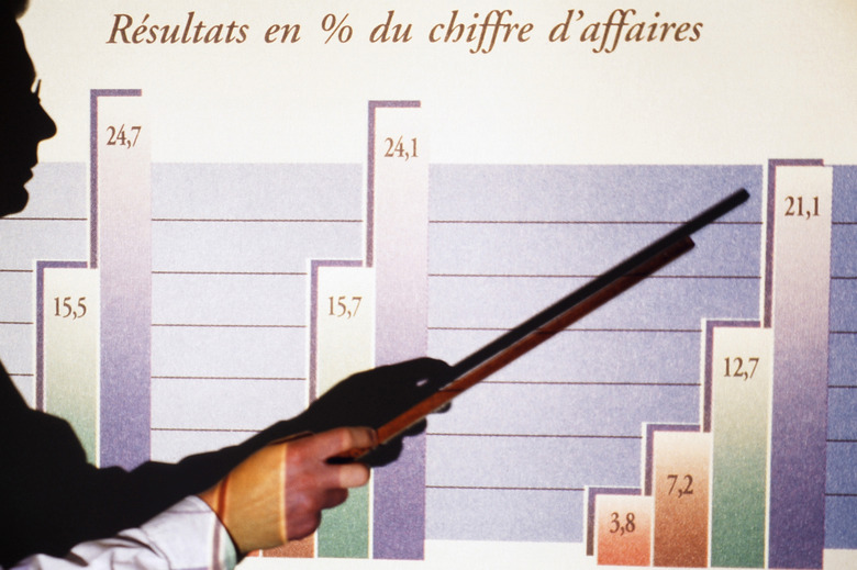
Using a histogram allows you to identify how frequently a range of data occurs within defined parameters. Although similar in appearance to a bar graph, the absence of a space between the columns of data distinguishes a histogram from a bar graph — where data columns include a space between each. To read and accurately analyze the information in a histogram you need to start by adding information correctly. Correct labeling is an essential first step in the process.
Step 1
Look at the table from which you will be extracting data to get ideas for appropriate histogram labels. As an example, consider a table that shows income levels by age group or hours a group of students spends watching television.
Step 2
Look at a blank graph and identify its x and y-axis. The x-axis always runs horizontal — along the bottom of the histogram and the y-axis runs vertical — or lengthwise.
Step 3
Label the y-axis to identify what you are measuring. A label such as per capita income is appropriate for a histogram displaying income levels by age group. Number of students is a good label for a histogram displaying hours a group of students spends watching television.
Step 4
Label the x-axis using a term called a quantitative variable identifier that identifies variable you are measuring. A label such as age is appropriate for a histogram displaying income levels by age group. Hours is a good label for a histogram displaying hours a group of students spends watching television.
Step 5
Add details along the x and y-axis to indicate quantity and to break the data into equal ranges. If you are displaying per capita income up to $40,000, you can include an income range such as $10,000, $20,000, $30,000 and $40,000 along the y-axis and age groups such as 25 to 34, 35 to 44, 45 to 64 and 65 to 74 across the x-axis. If you are displaying hours a group of 20 students spends watching television, you can label the students in groups such as two to four along the y-axis and a range of hours, such as 1 to 3, 4 to 6, 7 to 9 and 9+ hours along the x-axis.
Cite This Article
MLA
Lohrey, Jackie. "How To Label A Histogram" sciencing.com, https://www.sciencing.com/how-to-label-a-histogram-12750957/. 2 October 2011.
APA
Lohrey, Jackie. (2011, October 2). How To Label A Histogram. sciencing.com. Retrieved from https://www.sciencing.com/how-to-label-a-histogram-12750957/
Chicago
Lohrey, Jackie. How To Label A Histogram last modified March 24, 2022. https://www.sciencing.com/how-to-label-a-histogram-12750957/
