How To Make Bar Graphs
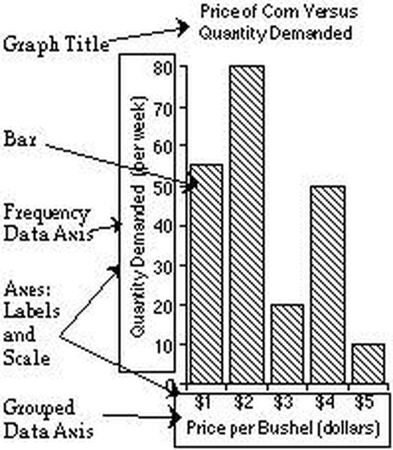
Bar graphs are a great way to visually display your data in order to compare items or show how they change over time. Making a bar graph and plotting your data is a simple process once you understand the basic components of all bar graphs. All bar graphs have 4 basic elements. The first is a title, which is a critical component of the bar graph because it clarifies the overall significance of the data. The second element of a graph is the x (horizontal) axis, which can also be called the grouped data axis because it represents the data groups. The third element is the y (vertical) axis (or frequency data axis), which represents the frequency at which the data occurs. The final graph component is the bars themselves, which are rectangular blocks. Each bar represents the data for one data group, and the height of the bar corresponds to the frequency of the data. In this article, you will learn how to create a bar graph that incorporates each of these 4 required elements.
Step 1
Label the horizontal axis in a way that tells what information will be provided on the grouped data axis. Above the label, write each of the categories of your data. For example, if your graph is comparing the price of corn per bushel, you would label the grouped data with "Price Per Bushel (Dollars)," and then write the range of prices.
Step 2
Label the vertical axis in way that clarifies the frequency of your data. You must begin at the intersection of the two axes. Depending on how large your numbers are, you may need to count by 2's, 5's, 10's, or even 100's as you mark. Using the same example from step 2, you would start at the bottom with a price of 0, then mark 10, 20, 30, 40, etc. until you reach the number above the highest price.
Step 3
Draw in the bars for your graph, ensuring that each bar's height corresponds to its data. In this example, the base of the bars is at the horizontal axis. You may choose to color the bars to make your graph more attractive and easier to read.
Step 4
Write a title for your graph right above it. The title should give a clear indication as to what the data shows. "Price of Corn Versus Quantity Demanded" would be a good name for the sample graph explained in the instructions above.
Things Needed
- graph paper (or plain white paper)
- pencil/pen
- colored pencils (optional)
TL;DR (Too Long; Didn't Read)
You can also make a graph online (see the links listed below). These graphs look more polished than hand-drawn ones, and can be saved to your computer to be shared through email and other Internet applications.
Cite This Article
MLA
Watson, Angela Powell. "How To Make Bar Graphs" sciencing.com, https://www.sciencing.com/make-bar-graphs-4843320/. 24 April 2017.
APA
Watson, Angela Powell. (2017, April 24). How To Make Bar Graphs. sciencing.com. Retrieved from https://www.sciencing.com/make-bar-graphs-4843320/
Chicago
Watson, Angela Powell. How To Make Bar Graphs last modified March 24, 2022. https://www.sciencing.com/make-bar-graphs-4843320/
