How To Make Predictions From A Graph
While nobody knows what the future holds, a graph can be a handy tool to help a person to make predictions about the future based upon past experience. For example, if a graph is showing an upward trend in sales, then a person can make a reasonable prediction that sales will continue their upward trend as long as no variables change.
Step 1
Recognize the value of a graph. When a person is looking at a spreadsheet of data, it can be difficult to notice trends. Converting that data into a graph provides a different way of looking at the same information. A graph can make it much easier to notice trends that are not as obvious when viewing the raw data, which makes it much easier to make predictions.
Step 2
Include a large sample of data in the graph. Many industries ebb and flow in the short run but show a consistent trend over the long haul. For example, the United States stock market often shows volatility in the short run, but has shown consistent growth when viewed over a long period of time. Make sure you include enough data in your graph to make an accurate prediction.
Step 3
Look for trends in the graph. For example, sales for an ice cream parlor are likely to go down in the winter months and then go back up during the summer months. Viewing a graph that covers several years of sales would likely show this trend. Once you see the trend repeated over several years, you can reasonably make a prediction from a graph that ice cream sales during the next year will be low in January and high in July.
Step 4
Observe places where the graph deviates from the trend. For example, if an ice cream parlor had a fire and closed its door in July one year, then sales would be down during that time. This would be a deviation from the general trend shown on the graph. When you see a deviation, try to identify the variables that could account for the deviation. Then, factor in those variables when making predictions from the graph about future sales.
Step 5
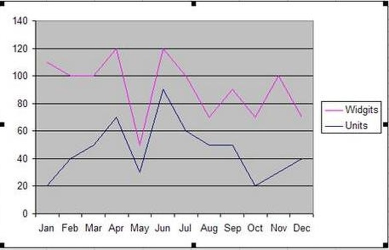
Analyze specific types of graphs. With a line graph, it is fairly easy to make predictions because line graphs show changes over a period of time. You can look at past performance in a line graph and make a prediction about future performance. With bar graphs and pie charts, you need to compare graphs from different periods of time and notice the changes between the two to make predictions.
TL;DR (Too Long; Didn't Read)
Consider combining several bar graphs into one large bar graph with a different colors for each time period. By combining bar graphs in this manner, you can more readily see trends for different times periods and notice deviations, which is helpful in making predictions.
Warning
While past performance is the best indicator of future performance, it is no guarantee for future performance. Variables can change in any industry, causing a change in trends. While you can make a reasonable prediction from a graph, predictions are merely educated guesses and are sometimes wrong.
Cite This Article
MLA
Contributor, . "How To Make Predictions From A Graph" sciencing.com, https://www.sciencing.com/make-predictions-from-graph-4481030/. 24 April 2017.
APA
Contributor, . (2017, April 24). How To Make Predictions From A Graph. sciencing.com. Retrieved from https://www.sciencing.com/make-predictions-from-graph-4481030/
Chicago
Contributor, . How To Make Predictions From A Graph last modified March 24, 2022. https://www.sciencing.com/make-predictions-from-graph-4481030/