What Is A Number Line Plot?
Graphs are a simple way to display and draw conclusions about data. A "number line plot" provides a quick snapshot of trends in the data. Thiat type of graph can be used by children and adults for the information collected through informal and formal surveys and research.
Facts
Facts
A number line plot is a graph that displays the frequency a number occurs in a set of data. Dot plot is another name for a number line plot. The graph can be used to find the mean (average), median (middle number when ordered least to greatest), range (the difference between the largest and least number), and mode (most frequently occurring number in a set of data).
Features
Features
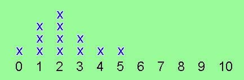
Number line plots consist of a horizontal line, also called the x-axis, with equal intervals labeled with values. The graph should also have Xs or dots to represent the frequency that a number, or the numbers in an interval, occur. Data is represented on the axis as stacks of those Xs or dots. A title and label on the x-axis are necessary for the reader to understand the graph's purpose.
Advantages
Advantages
A number line plot provides a quick visual representation of trends in data. One can easily determine the mode of the data, as well as the least frequently occurring number, by comparing the height of the columns. If a box is drawn around the Xs or dots in each column, the graph becomes a bar graph.
How to Make a Line Plot
How to Make a Line Plot
Try this exercise to practice making a line plot. Using the data set {1, 0, 3, 5, 7, 1, 2, 9, 2, 0, 5, 3, 2, 4}, start by ordering the data from least to greatest. Decide what intervals to use on the number line. In this example it would be appropriate to use intervals of one, starting with the least value, 0, and ending with the largest value, 9. Don't skip any intervals between 0 and 9, even though there is no data for some intervals in the data set (note that there is no data for "6" nor for "8"). Next, draw a horizontal number line and label the intervals from 0 to 9, under the line. Above the line, draw an X or dot for every time that number occurs in the set.
Considerations
Considerations
The number line plot should be used for data with less than 30 to 40 values in the data set. The more values on the graph, the more difficult it is to identify trends using a number line plot. Another consideration is to only use the number line plot when the values are within a reasonable range. For example, use a number line plot for graphing the how many students in a typical classroom like chocolate, vanilla, or strawberry ice cream the best. A difficult set of data to graph would be graphing how many people in New York City live on specific streets — there would be too many values to graph in that data set. Also, keep the Xs and dots the same size and in straight lines or else the columns will be distorted.
Cite This Article
MLA
Scott, Stephanie T.. "What Is A Number Line Plot?" sciencing.com, https://www.sciencing.com/number-line-plot-5127079/. 24 April 2017.
APA
Scott, Stephanie T.. (2017, April 24). What Is A Number Line Plot?. sciencing.com. Retrieved from https://www.sciencing.com/number-line-plot-5127079/
Chicago
Scott, Stephanie T.. What Is A Number Line Plot? last modified March 24, 2022. https://www.sciencing.com/number-line-plot-5127079/